As 2024 draws to a close, we’ll take a look this week at long term annual and quarterly silver price charts that look incredibly optimistic for 2025 and beyond.(Click on image to enlarge)
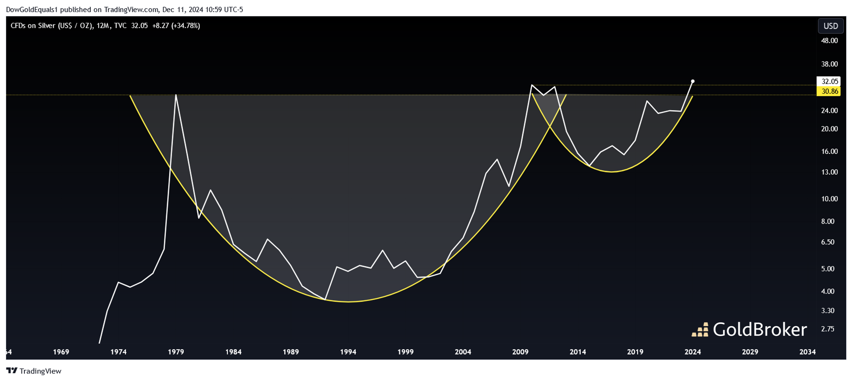
The first is an annual line chart that clearly shows silver’s 45-year Cup and Handle Pattern. For those who might be new to technical analysis, the cup & handle is one of the most explosive of patterns, and when they break out, their measured move is equal to the move from the bottom to the top of the cup. Silver’s cup & handle is the largest such pattern that I have ever seen on any chart, and a breakout suggests a move well into the triple digits. Here, we can see that silver is indeed breaking out and needs to close the year higher than the ATH of $30.86 set in 2011 to set the stage for an explosive move higher.(Click on image to enlarge)
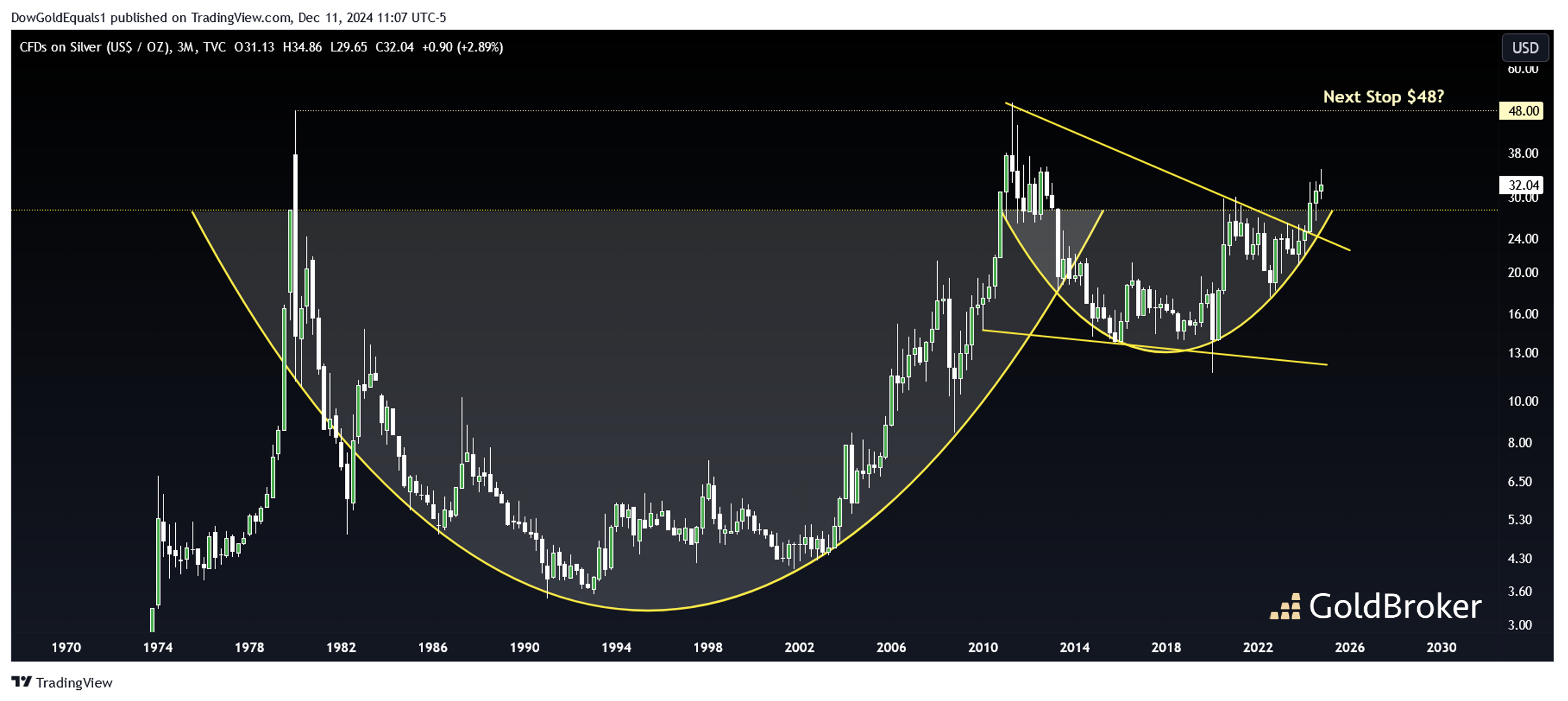
Next, we’ll look at the same cup & handle on a quarterly bar chart. Here, the extra detail shows us that price is also breaking out of a very large and very well defined bull flag. There is now very little resistance between $32 and the historic highs between $48 and $50. It would not be at all surprising to see these levels achieved over the next 12 months or so.(Click on image to enlarge)
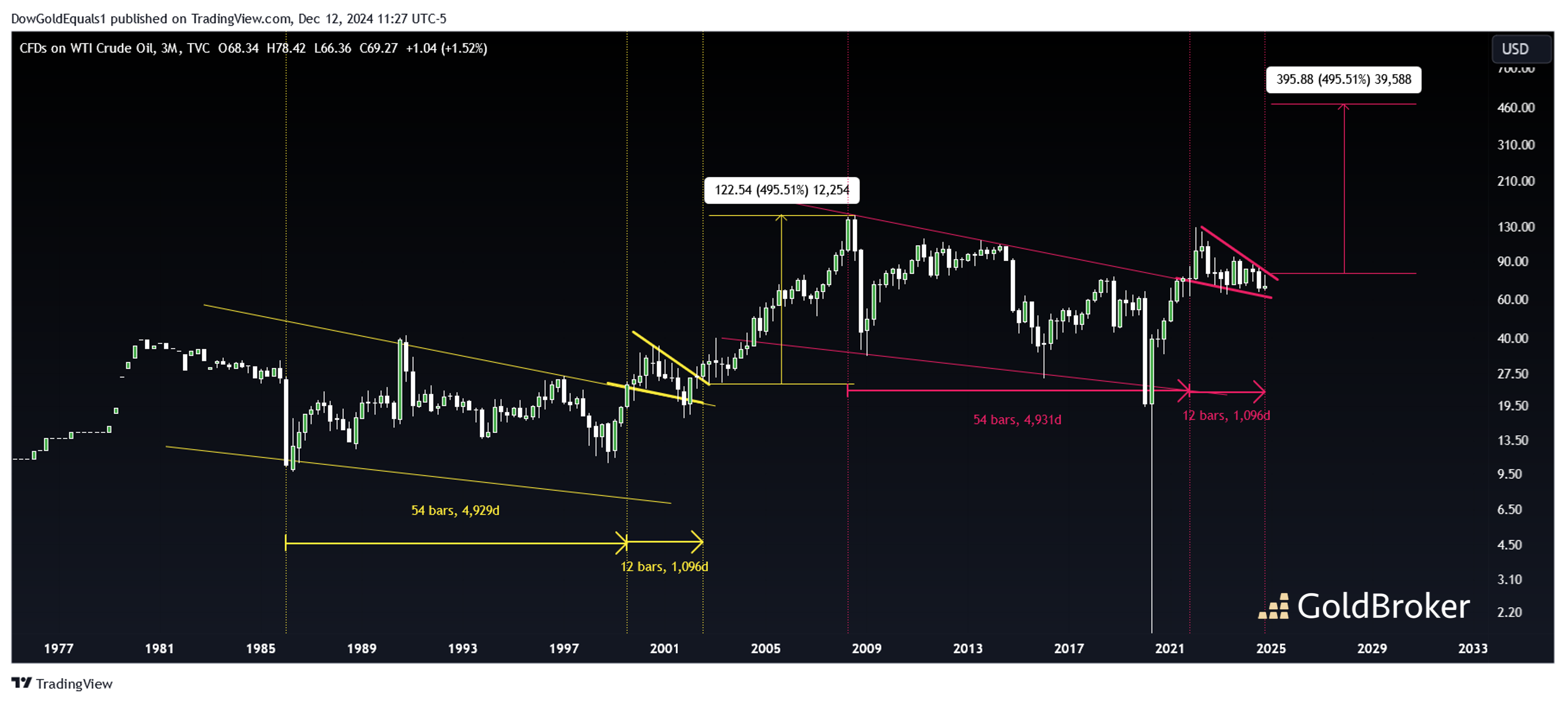
Finally, I’d like to show you an oil chart fractal that you have likely not seen before. While many oil traders are keenly aware of the pink bullish wedge that began forming in 2007 and the breakout consolidation that began in 2022, I haven’t seen anyone yet point out that the pink patterns are exact replicas of the yellow patterns that began in the 1980s. Not only are the wedges and consolidation flags the exact same amplitude, but price has now spent the exact same amount of time within each pattern (from first rail reversal to breakout). Based on history, we then should not be surprised if oil breaks out of its consolidation next year and begins an impulse move higher. If the pink impulse move is like the yellow one, we’re looking at $400+ oil within 10 years. Is this possible, and what does this mean for general inflation over the next decade?More By This Author:
Year-End Look At Silver’s Epic Breakout, And An Oil Chart For The Ages

