With the market focus at the NFP number release will be on one simple statistic: did the March Payrolls number beat or miss the nice round number expected of 200K (after all algos can’t process more than that in 1 nanosecond), the real story in the past several years has been not about the headline establishment survey trend but everything else, especially the labor force participation (plunging), average weekly hours (plunging) average weekly compensation (plunging), and the demographic change in the labor force (will workers aged 55 and over hit a new record high? Why yes). All these are metrics and dynamics we, unlike the vacuum tubes, follow closely and will summarize after today’s number.
In fact, perhaps the least important metric of all is, paradoxically enough, the unemployment rate itself, which even the humiliated Fed was forced to admit no longer reflects the true level of workforce “slack” as it is mostly for propaganda purposes, resulting in an end in the Fed’s forward guidance.
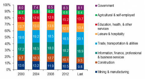
Yet one aspect of the jobs data we haven’t shown before, and which BofA focuses on this morning, is the unemployment rate by industry. For all those curious what the data looks like, here is the summary.

Unemployed by industry:Â The trends by industry show that a shrinking share of the unemployed is in the goods-producing sector. Unemployed workers in manufacturing and mining only make up 9.8% of the unemployed compared to 13.6% in 2000. The construction sector left a large number of unemployed workers, but it has since dwindled and the share is back to 2000 levels. This could reflect the fact that construction workers dropped out of the labor force. As housing recovers, at least some of these workers should come back. Meanwhile, there is a growing portion of unemployed in sectors such as health care and business services.
