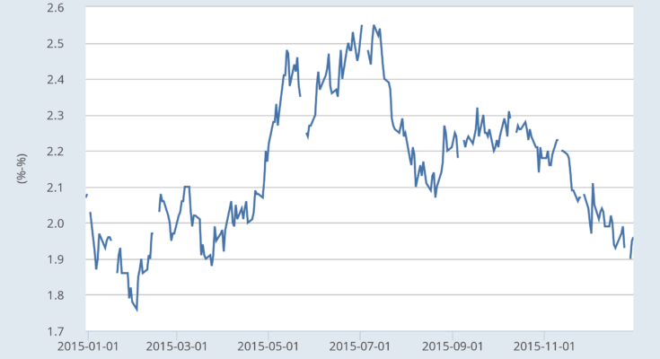

What little difference a year makes. The top chart shows the 30-2 year spread, which only narrowed 18 basis points over the year. The bottom chart shows the yield curves as of December 31 and compares it with the curve a year earlier. This year’s curve is higher by the following amounts:
- 30 yr. 26 BP
- 20 yr. 20 BP
- 10 yr. 10 BP
- 5 yr. 11 BP
- 2 yr. 39 BPÂ
This tells us the following:
- There is no expectation of inflation. The 30 year treasury is currently yielding 3.01%. While it rose 26 basis points over the year, it’s just as easy to attribute that move to the anticipated Fed rate hike as it is inflationary expectations. The Cleveland Fed’s 10-year inflation expectation is 1.81%, confirming this point.Â
- The treasury market sees mild growth at best. If there was an expectation of major growth, we’d see a much stronger sell-off, especially in the long end of the curve as traders abandoned fixed returns for potentially higher yielding assets.Instead, the rise was very small. This explains why the Cleveland Fed’s interest rate GDP model predicts a 1.9% growth rate along with the 1.54% 10-year CMT/10-year TIPS spread .
- The possibility of a recession is very low: the yield curve typically inverts before a recession. The yield curve is far away from that possibility. This explains why the Cleveland Fed’s interest rate GDP model predicts a 1.9% growth rate .
Let’s now turn to the week charts of the various treasury ETF, breaking them down into two groups: the shorter end (IEIs and IEFs) and the longer end (TLH’s and TLTs).
Let’s start with the shorter end:


Both the IEI’s and IEF’s are in an uptrend – although they are right at technical support. Both have weaker momentum and RSI readings, indicating their potentially ready to move through support, but neither are there yet.


The ETFs on the long end of the curve broke their respective uptrends in April. Both have since consolidated in triangle patterns. The lack of a major sell-off indicates there is still concern about long-term growth prospects.

