Home buyers in every city and state have been benefiting from a powerful financial cycle for almost five years. Most people are not aware of this cycle, but it has lowered the average monthly mortgage payment for home buyers on a national basis by about $250 per month since the end of 2013.
The interest rate cycle in question is one of “yield curve spread” expansion and compression, with yield curve spreads being the difference between long term and short term interest rates. This interest rate spread has been going through a compression phase in its ongoing cycle, meaning that the gap between long term interest rates and short term interest rates has been falling sharply in recent years.

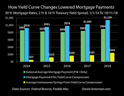
The green bars in the graph above show national average mortgage payments (principal and interest only), and they fell from $861 a month in 2013 to $809 a month in 2016, and have now risen to $894 per month. However, without the narrowing of the spread between short term rates and long term rates – mortgage payments would have been entirely different (and likely home prices as well).
 Without the cycle of yield curve spread compression – then as shown with the blue bars, average mortgage payments would have been above $900 per month even in 2014, and they would have risen every year since without exception. If it had not been for compression, national average mortgage payments would have reached $978 per month in 2016 (instead of $809), and then $1,138 per month in 2018 (instead of $894).
The yellow bars show the average monthly savings for everyone buying a home during the years from 2014 to 2018. The monthly reduction in mortgage payments has risen from $57 per month in 2014, to $169 per month in 2016, to $244 per month by 2018 (through the week of October 11th).
In other words, the average home buyer in the U.S. in 2018 is saving almost $3,000 per year in mortgage payments because of this little known cycle – even if they’ve never heard of the term “yield curve”. Indeed, while the particulars vary by location – home affordability, home prices and disposable household income have been powerfully impacted in each of the years shown by this interest rate cycle, in every city and neighborhood across the nation.
While knowledge of this cyclical cash flow engine has not been necessary for home buyers (and sellers) to enjoy these benefits in previous years, an issue has developed over the course of 2018 – the “fuel” available to power the engine has almost run out. Which means that mortgage payments, home affordability and housing prices could be traveling a quite different path in the months and years ahead.

The yield curve spread is shown in the blue area above, and it was quite wide at the beginning of this particular cycle, equaling 2.62% as of the beginning of 2014. It has been steadily used up since that time, however, with the compression of the spread being shown in red. As of the current time – the yield curve compression which has powered the reduction in mortgage payments has almost maxed out, the blue area is almost gone, and the ability to further compress (absent an inversion) is almost over.
This analysis is part of a series of related analyses, an overview of the rest of the series is linked here.
(More information on the data sources and calculations supporting the summary numbers above can be found in the rest of series, as well as in the more detailed analysis below. A quick summary is that mortgage rates are from the Freddie Mac Primary Mortgage Market Survey, Treasury yields are from the Federal Reserve, the national median home sale price is from Zillow for the year 2017, and the assumed mortgage LTV is 80%.)
A Cyclical Home Buyer Savings Engine
A yield curve spread is the difference in yields between short term and long term investments, and the most common yield curve measure the markets looks to is the difference between the 2 year and 10 year U.S. Treasury yields.
An introduction to what yield curves are and why they matter can be found in the analysis “A Remarkably Accurate Warning Indicator For Economic & Market Peril” (linked here). As can be seen in the graph below and as is explored in more detail in some of the linked analyses, there is a very long history of yield curve spreads expanding and compressing as part of the overall business cycle of economic expansions and recessions, as well as the related Federal Reserve cycles of increasing and decreasing interest rates.

Since the beginning of 2014, the rapid shrinkage of the blue area shows the current compression cycle, and a resemblance (in broad strokes) can be seen with the compression cycles of 1992 to 2000 and of 2003 to 2006.
What has seized the attention of the markets in recent months is what followed next in some previous cycles, which is that yield curve spreads went to zero and then became negative, creating “inversions” where short term yields are higher than long term yields (as shown in the golden areas).
This is important because while such inversions are quite uncommon, when they do occur – they have had a perfect record in recent decades (over the last 35 years) of being followed by economic recessions within about 1-2 years.
However, yield curves don’t have to actually invert in order to turn the markets upside down, and as explored in the analysis linked here, when the Fed goes through cycles of increasing interest rates, we have a long term history of yield curve spreads acting as a countercyclical “shock absorber”, and shielding long term interest rates and bond prices from the Fed actions.
