Â

Â
2015 has so far been a trying year for investors patience. The financial media will be quick to highlight and emphasize all of the major pitfalls (Greece, Fed raising rates, etc.) that could derail the bull market. I, on the other hand, will take a look at a few bright spots in the data and price action.
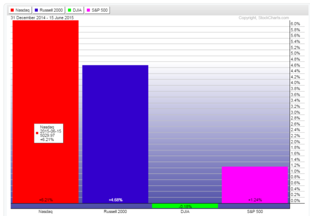
The chart above shows the year to date return of the four major market averages. The tech heavy Nasdaq and the Russell 2000 (small caps) sport gains in the 5-6% range while the S+P 500 and the Dow struggle at the flat line. Not only is this another indication of how diversification can help your portfolio (especially in choppy markets), this also shows investors still willing to take some additional risk, at least for the moment.

This next chart is of the financial sector ETF (Symbol: XLF), this fund holds all of the financial companies located within the S+P 500 index. This sector makes up about 16% of the S+P 500 and is the second largest sector, Information Technology being the largest.
In late 2014 and then again in early 2015 about $2.25 before finding support and making a new bull market high. If this pattern continues I would expect to see XLF trading above $26 in the not to distant future.
Last week the XLF briefly made a new bull market high before dipping back down with the broader market. However the overall outperformance of the sector itself bodes well for the overall market.
