
(Click on image to enlarge)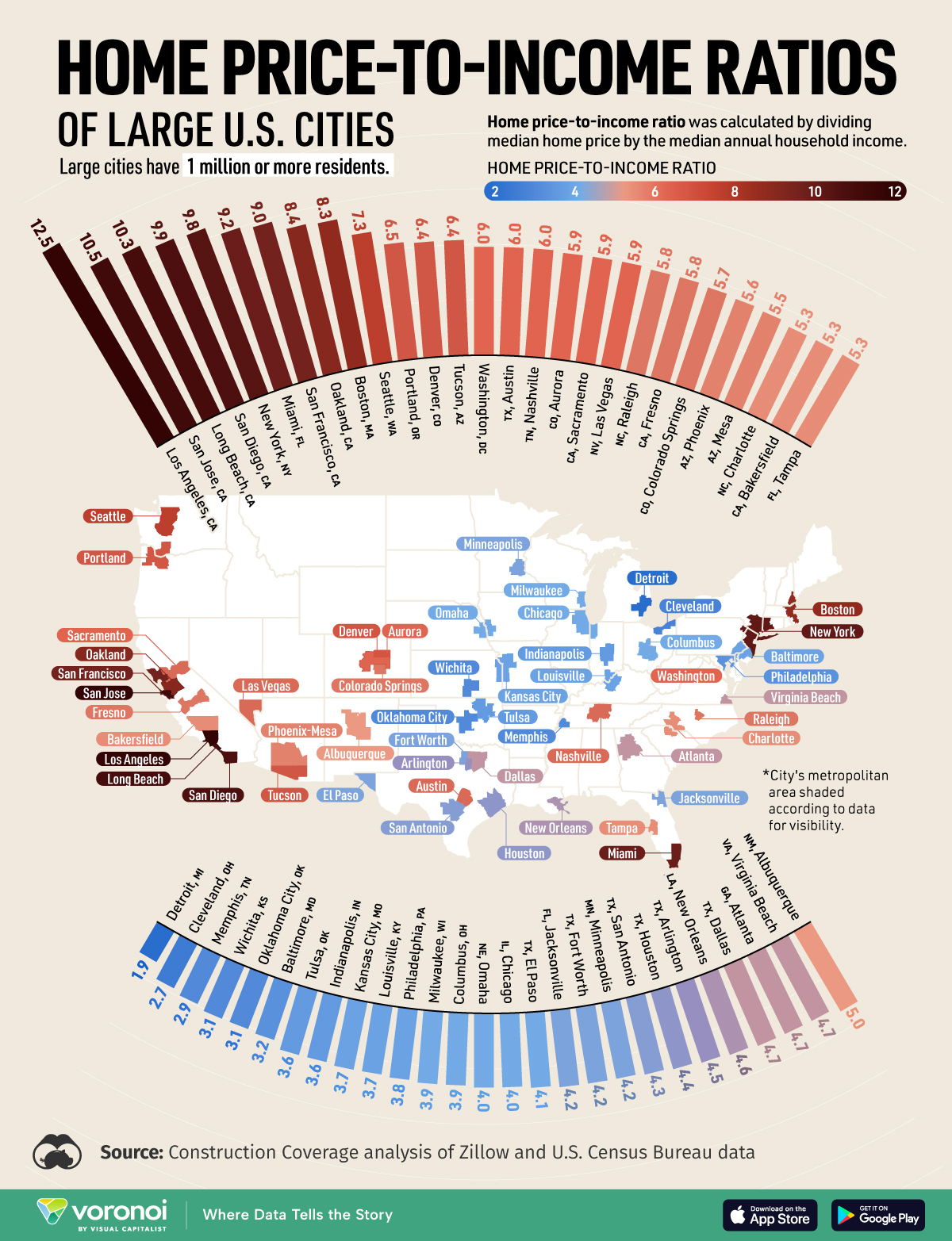
Many Americans continue to find homeownership financially out of reach due to and , among other contributing factors. But which U.S. cities are the least affordable?One way to assess housing affordability is through the home price-to-income ratio, which measures the ratio of the median home price to the median household income.This map shows the home price-to-income ratio of 54 large cities (population over one million) in the U.S. using data from Construction Coverage’s of Zillow and U.S. Census Bureau data.
Housing Affordability Worst in Coastal U.S. Cities
Below, we show the home price-to-income ratio, median home price, and median household income, for 54 large cities in the United States of America.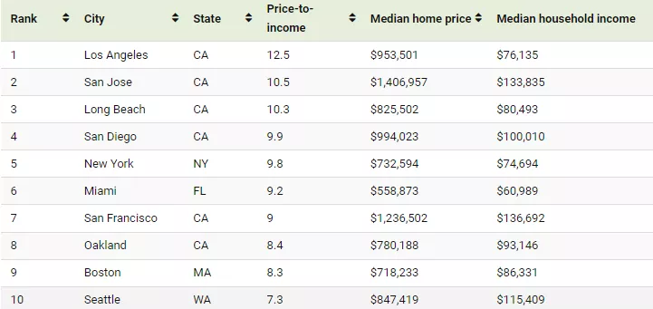
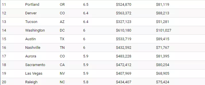
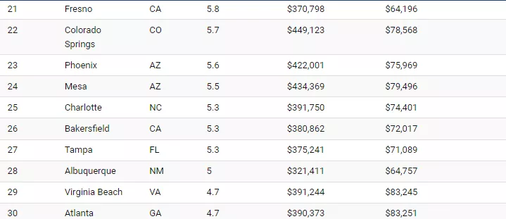


Cities on the West Coast, particularly in California, face the most significant housing affordability challenges.The top four cities with the highest ratios are all in California, while other major West Coast cities like San Francisco, Seattle, and Portland rank among the top 15.The top five cities, including New York City, have a home price-to-income ratio more than double the national average of 4.7, making them highly unaffordable.While median household income in cities like San Francisco, San Jose, and Seattle are among the highest in the country, they also have some of the in the country.The Midwest and parts of the South have much lower ratios, including Detroit (1.9), Cleveland (2.1), and Memphis (3.1). Midwest cities consistently rank among the most affordable for housing and .More By This Author:Charted: The Speed At Which New Technologies Go Mainstream China’s Cobalt Supply Dominance By 2030 The EU’s Major Trade Partners In One Chart
