
Because your own strength is unequal to the task, do not assume that it is beyond the powers of man; but if anything is within the powers and province of man, believe that it is within your own compass also. ~ Marcus Aurelius
 In this week’s Dirty Dozen [CHART PACK] we go over the 2023 leaders and losers, look at whom shifting momentum is favoring going into 24’, dive into our favorite names and plays within those markets, follow that up with a look at improving liquidity, cover stretched sentiment/positioning, and finally we discuss a Japanese equity play that’s on the run, plus more…1. 2023 is behind us and here are the winners and losers amongst global equity markets.Nasdaq was the solid leader with Mexico and Brazil bringing up 2nd and 3rd place. The Dow put in a strong 4th and finished the year with the strongest major US equity index from a technical pov. The big loser was China returning -11.5% on the year (chart via ).
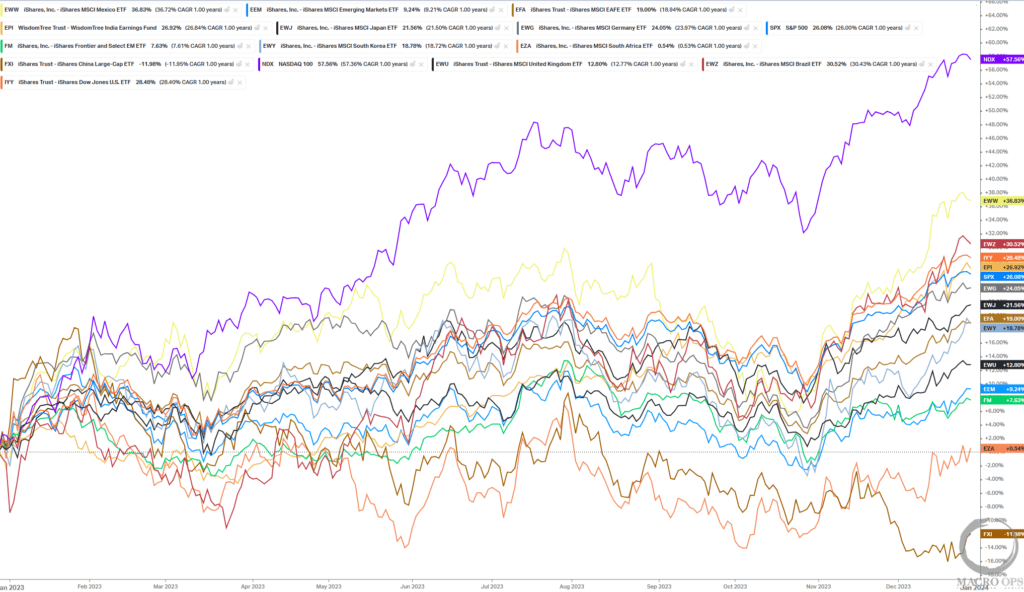
2. Zooming in for a closer 3-month return look to see where momentum is shifting, we can see both Brazil () and Mexico taking the top two spots while the Qs lose some steam, and China continues to sandbag it (chart via ).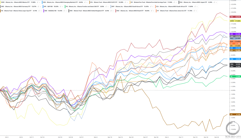
3. Momentum being one of the more reliable factors in markets as trends in motion tend to stay in motion. I think it’s a pretty good bet that Mexico () will be trading higher next year, and likely maintaining its strong relative performance.Here’s a yearly chart showing EWW which broke out from a 7-year sideways consolidation range this year. There’s a lot of to drive this trend higher over the next few years.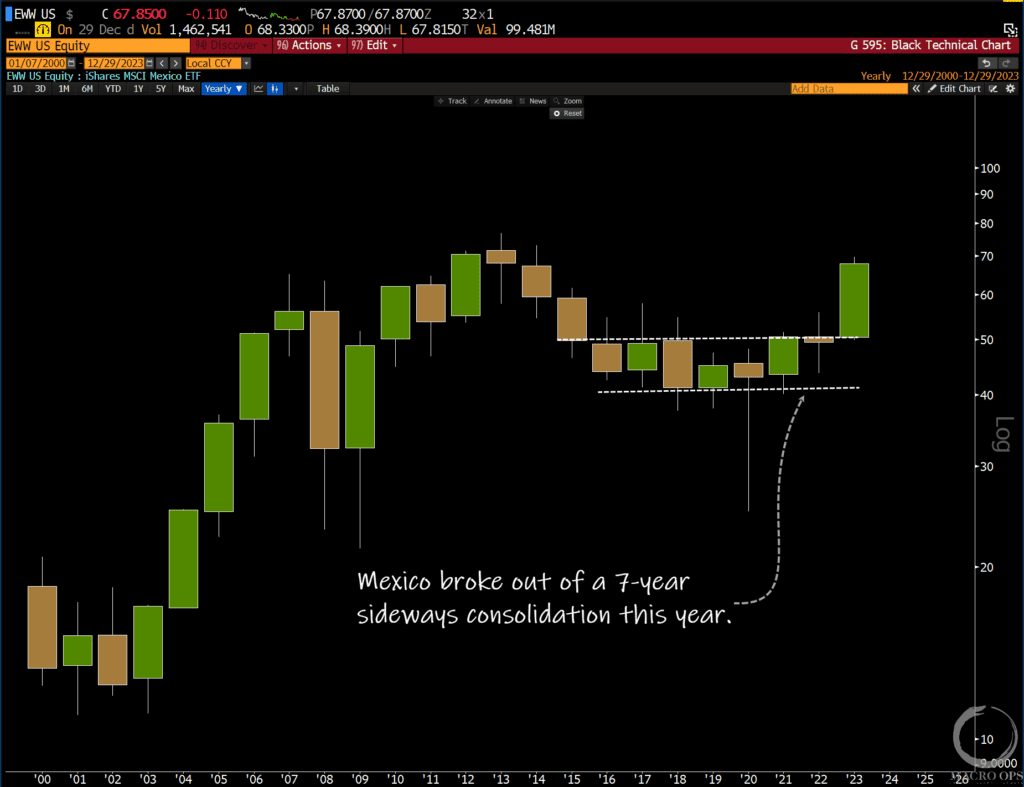
4. And there’s clearly been a significant sea change in Mexico which makes the market worth paying closer attention to. Here’s a yearly chart of the Mexican peso showing that it has strongly broken out from its 20-year downward channel versus the USD, also emerging from a 7-year sideways base.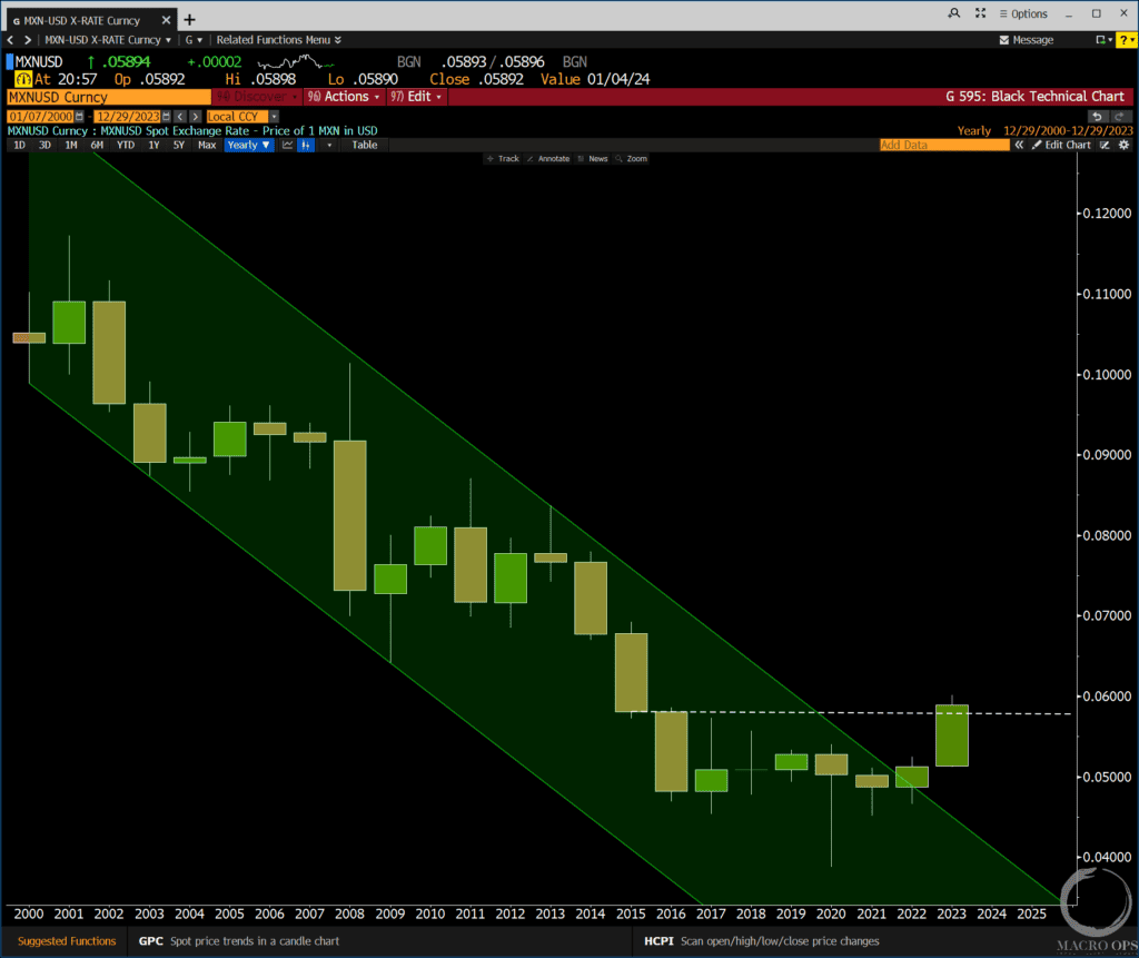
5. Here’s a monthly chart of the top-performing stock in EWW last year, Grupo Grupo Carso, S.A.B. de C.V., a large industrial/infrastructure company. With our Trend Fragility indicator at 100% , names like this will be good buys once this parabolic move ends and we get a multi-week/month pullback.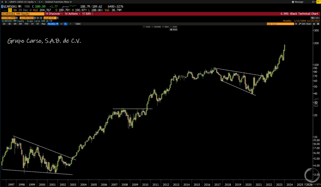
6. Out of the major equity markets globally, the Nikkei 225 index has the strongest yearly chart. Japan can seem like a confusing pick from a sentiment perspective because it’s become a popularly attractive market, where it seems most shops are noting its cheap values and positive catalysts.But… when a market has been a dead trade for as long as Japan has, it takes years of strong relative performance to turn the — and investor flows — to a point that more reflects the new reality.We bet that Japan will be an outperformer in the years ahead.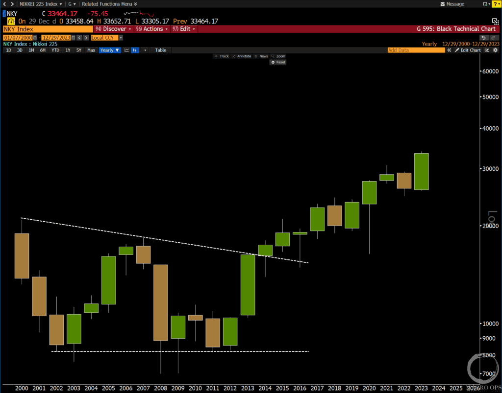
7. Our MO Liquidity indicator (a composite of financial stress data points) turned positive for the first time last summer and continues to surge higher. This indicates an improving liquidity backdrop, something we’ve been pointing out for months.And with inflation falling and Powell unwilling to rock the boat in an election year where Trump is the challenger, we likely see conditions stay relatively easy for the foreseeable future.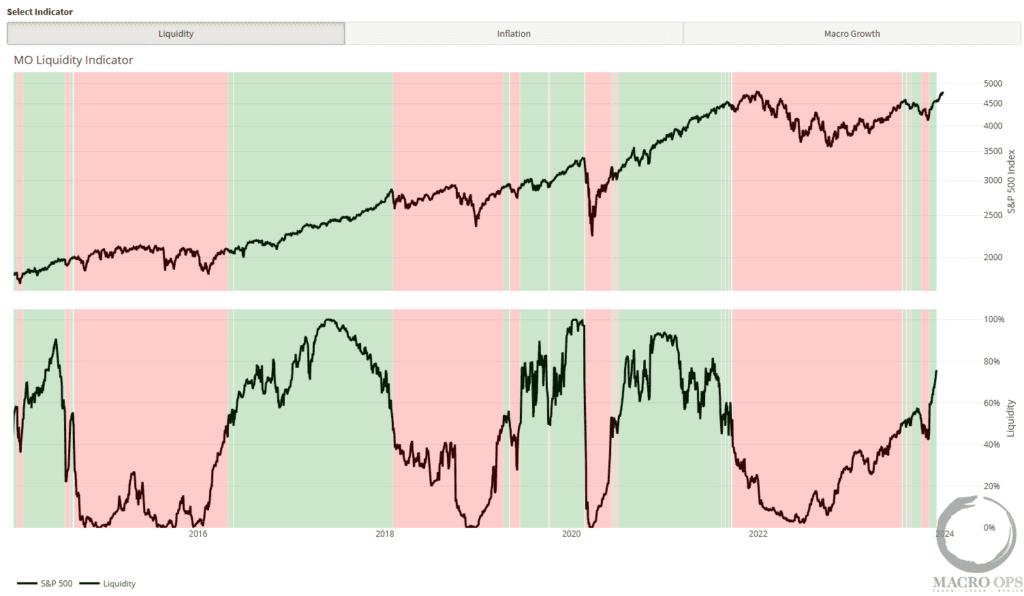
8. I don’t know when this parabolic bull move will end, that’s why we track internals and breadth and make moves as the chart moves. But take a look at major US Index average fund flows which have now spiked to Dec 21’ levels.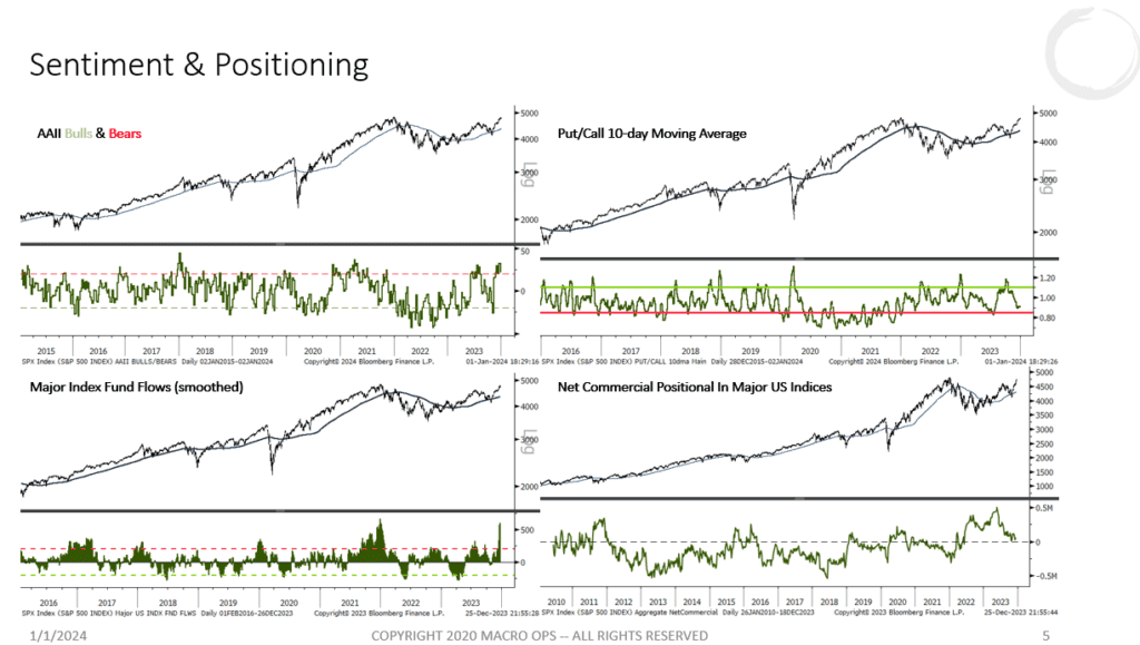
9. We expect the eventual correction will be a retrace within a broader primary bull trend. Continued signs of underlying strength, such as the McClellan Summation index below, point to odds favoring more upside follow-through. Here’s SentimenTrader commenting on the differences in the near-term overbought versus long-term strength:“History is clear that this type of “straight line” advance can only continue for so long. However, history also makes it clear that the broad-based buying required to trigger this signal often signals the momentum that tends to see the market follow through for many months.”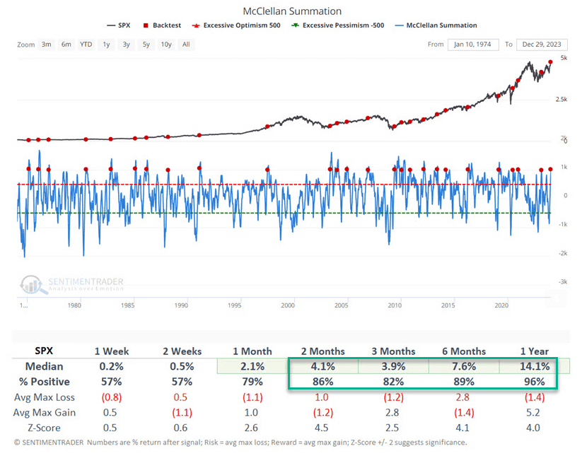
10. The other month we pointed out the rebound in South Korean exports, which serves as a reliable proxy for improving global growth.Well, Asian exports continue to improve over where they were a year ago. Overall this should attract capital flows out of expensive US markets and weigh on the USD.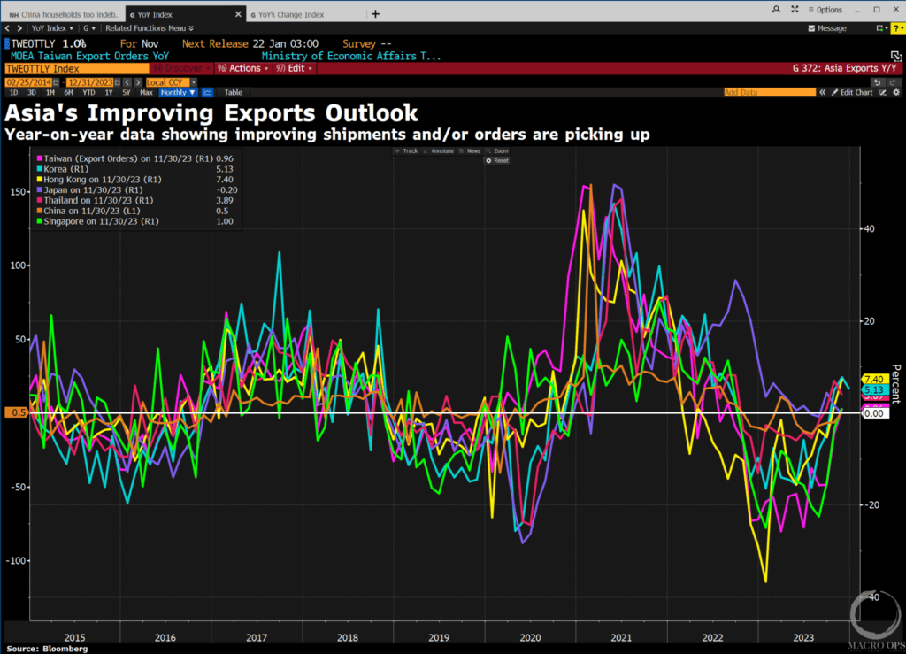
11. This chart shows US nominal GDP growth (white line), UST 10-year yields (blue), the spread between the two (green/red chart), and the real 10-year yield (orange line).A lot of commentators have been saying lately that the US won’t go into recession this year because nominal GDP is so high. This has been true but it’s the spread between growth and yields that matters, which is starting to get tighter.Note how when in the past nominal growth has fallen below 10-year yields, a recession soon followed. Just something to keep an eye on.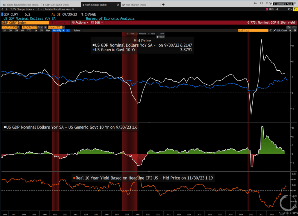
12. With Japan starting to get some more love, you might want to take a look at Nintendo (a).Below is a monthly chart showing a strong bullish thrust from a sizable base (note: we’re long).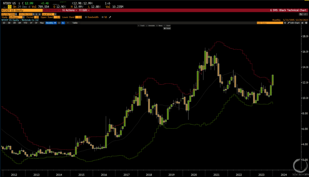 More By This Author:
