Guest Post by Michael Ashton
In normal times, by which I mean before actions of the Federal Reserve became the only data point that mattered, the monthly ISM report was important because it was the first broad-based look at the most-recent month’s data.
Now that the Fed’s taper has begun – right about the time that the uncertainty of the impact of Obamacare implementation was at its peak, curiously enough – the ISM data seems to have taken on importance once again. I must say that I did not see that coming, but since guessing at the Fed’s actions every six weeks and ignoring all intervening data was so all-fired boring, I suppose I am glad for it. Looking at economic data and trying to figure out what is happening in the economy is more like analysis and less like being on The People’s Court trying to rule on a he-said, she-said case where the hes and shes are Federal Reserve officials. And that is welcome.
That being said, the January ISM report isn’t one I would necessarily place at the head of the class of importance, mainly because it is January. Still, it was an interesting one with the Manufacturing PMI dropping 5.2 points, matching the steepest decline since October 2008. The New Orders subindex plunged to 51.2 versus 64.4 last month, and Employment and Production indices also declined significantly. It’s clearly bad news, but I would be careful ascribing too much value to any January number – especially one based on a survey.
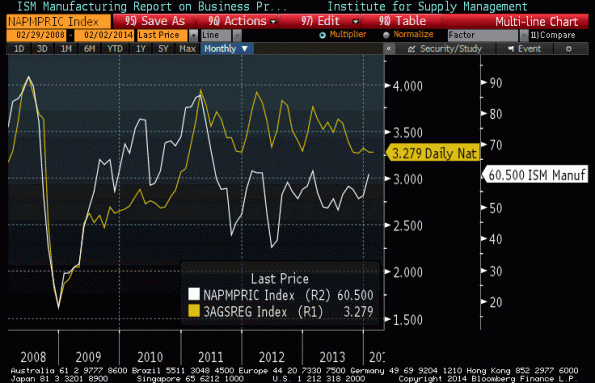
Also standing out in the report was the increase in the (non-seasonally adjusted) “Prices Paid†subcomponent, to 60.5. the jump was initially somewhat surprising to me because as the chart below – which I tweeted shortly after the number – seems to show, we have had a jump in Prices Paid that is not being driven by a concomitant jump in gasoline prices – and Prices Paid is predominantly driven by gasoline prices.

However, as I noted in that tweet, the Prices Paid index is measuring the rate of change of prices (the question posed to purchasing managers is whether prices are increasing faster, slower, or about the same as the month before), so just eyeballing it may not be enough. The chart below plots the 3-month change in gasoline prices versus the ISM Prices Paid subindex. What you can see is that the first chart is slightly deceiving. The change in gasoline prices has accelerated – back to zero after having been declining since February of 2013. And “unchanged†gasoline prices is roughly consistent with about 60 on the Prices Paid indicator. So, this isn’t as much of a surprise as it looked like, initially.

