Dips Are Bought, Pennants Indicate Trend Continuation
We recently came across the information that the DSI (daily sentiment index), a short term futures traders sentiment survey, clocked in at about 80% bulls. This is as high as at the interim peak in gold in late August 2013, so we want to caution that in the very short term, gold looks a bit stretched from a sentiment perspective. However, it must be pointed out that it is only this very short term indicator that shows a high level of bullishness. Similar enthusiasm is simply not reflected in any other sentiment data we watch. One point that needs to be made about the DSI is that it can sometimes remain stretched for long periods of time, and is moreover quite volatile, so that often a brief correction is all it takes to bring it back to a more balanced reading. Meanwhile, gold continues to look technically convincing and the same is true of gold stocks:
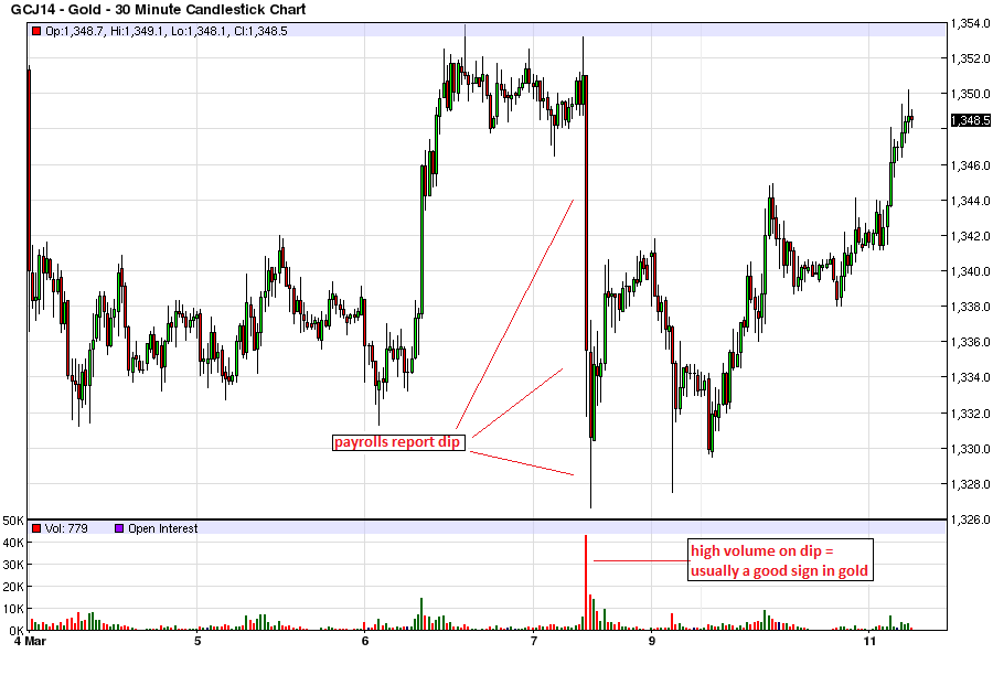
 Gold, April contract, 30 minute chart. The payrolls report dip was bought, with the low successfully retested earlier this week – click to enlarge.

The daily chart of the April contract has developed a bullish-looking pennant formation – click to enlarge.

Gold, public opinion – sentimentrader’s amalgam of the most important sentiment surveys. Contrary to the DSI, we see no sign of froth here as of yet. In fact, sentiment is at best lukewarm – click to enlarge.
Gold Stocks – Same Story, Only More So
Gold stocks have likewise built a pennant on the daily chart. A few things are worth noting: the 50-day moving average is now rising at the steepest clip since the rally of autumn 2012, while the 200-day ma is trying to flatten outfor the first time since turning down in late 2011. Prices are now above both moving averages, and we suspect will manage to remain above at least one or perhaps even both of them in the near to medium term in the event of a pullback. Note also that RSI remains stubbornly above the 50 mark so far this year, which is a positive sign as well. Here is the daily chart of the HUI illustrating this:
