A Slightly Ominous Development
Below we show a few stock market related charts that indicate that the recent rebound may well have been part and parcel of at least some sort of corrective period, in spite of several indexes attaining new highs. Note here that we don’t care why the market reportedly fell on Thursday. No-one knows for sure whether the reasons cited in the financial press were really the culprit (allegedly, a worsening of the Russian/Ukrainian situation was to blame; but very often the excuse doesn’t really matter. After all, the Ukraine situation was completely ignored so far).
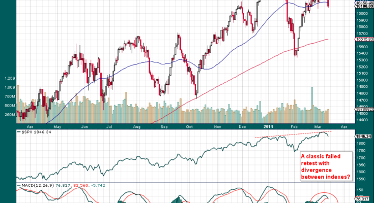
First, a chart of the DJIA and the SPX for comparison purposes. The interesting thing is that the two measures have diverged at the most recent peak. Note in this context that divergences in the performance of various indexes have been increasing since the beginning of the year. That is usually a negative sign.

The DJIA turned back down before reaching a new high, contrary to the SPX, which did (most other popular indexes also reached new highs, but performance divergences have opened up further between all of them) – click to enlarge.
We realize of course that a few down days don’t necessarily mean much, even if one of them was a big one. However, trading volume has declined throughout the rebound, and one could therefore interpret the action as an ‘Ordian retest’ (following Tim Ord’s rule for retests that occur on lower volume), even though most indexes actually managed to eke out slight new highs. The fact that the DJIA did not confirm the other measures is definitely ominous. Keep in mind though that the monetary backdrop suggests that there is still enough juice out there to keep asset prices elevated. However, since it is simply not possible to tell with certainty at which point the continuing slowdown in money supply growth will actually begin to matter, one must remain alert – especially as there are many signs that we are in the middle of a veritable mania of historic proportions.

