This article represents Part 1 on the comparative performance of U.S. and European banks since 2001. (The full paper is available for download from the Social Science Research Network: SSRN. The alternative title refers to the R.L. Burnside song It’s Bad, You Know, featured in an episode of The Sopranos).
Taking a longer-term view, I find that U.S. banks earned significantly larger stock returns than their European counterparts in the post-crisis years, accompanied by higher rates of revenue and loan growth, lower risk, and superior profitability and loan quality. European banks, on the other hand, remain trapped in a downward spiral of negative revenue and loan growth, decreasing profitability, increasing impaired and nonperforming loans, and are sporting market value to debt ratios that suggest imminent insolvency.
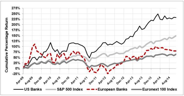
Following are my findings about revenue growth and loan portfolio quality. The next article will cover profitability, capital ratios, interest on deposits and payouts to shareholders. Let’s start with stock returns since April 2009, shown in the graph below.

We know that both corporate profit growth and key macro drivers have been far stronger in the U.S. post-crisis, thus we see the S&P 500 (+150%) outperforming the Euronext 100 (+65%), and the average returns of the U.S. banks (+232%) significantly higher than their European counterparts (+80%). Both sets of banks have had difficulty growing their total revenue post-crisis, as shown in the graph below.

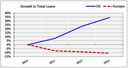
If you follow David Stockman on TalkMarkets, you are familiar with his many excellent articles regarding peak debt around the world. Despite rocky revenue growth, U.S. banks grew their loan portfolios every year post-crisis, for a total gain of +35% from 2010-2013. Over the same period, Eurozone banks’ loan portfolios shrunk by 10%:
Whether growing or shrinking, the quality of banks’ loan portfolios is a critical issue. The following graph shows the percentage of each set of banks’ loans classified as impaired, restructured or nonperforming since 2001:
