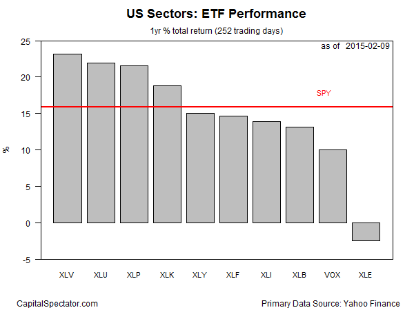
Is there a shift of leadership underway? The weakness in U.S. utility stocks in the last two trading sessions has conceded the top spot to healthcare companies for the trailing 252-day (1 year) period. Meanwhile, energy stocks appear to be stabilizing after a wave of selling that battered the sector in recent months.
Health Care Select Sector SPDR (XLV) is currently in the lead when measured by 1-year total return through yesterday’s close (Feb. 9). The ETF is ahead by 23.1%, which is slightly better than the 22.0% rise for the Utilities Select Sector SPDR (XLU) over that span.
The Energy Select Sector SPDR (XLE) is still the worst performer among US sectors, posting a mild 2.4% loss over the past 252 trading days. Compared with recent history, however, the modest setback for energy shares for the trailing one-year window represents progress compared with the steep losses that previously weighed on these firms. In fact, reviewing recent trading action suggests that the worst has passed in terms of bear raids for companies in the energy patch via XLE’s portfolio.
Meanwhile, the majority of sector ETFs are currently trailing the broad market, defined here as the SPDR S&P 500 (SPY). Of the ten sector funds that comprise the S&P 500, four have generated stronger performance results over the past year.

Â
Here’s a look at how the trailing one-year performance histories compare by indexing all the sector ETFs to 100 as of Feb. 10, 2014. Note that the last two setbacks in energy stocks (XLE) have met resistance around the 90 mark in the chart below (purple line at bottom).

Â
Finally, here’s a comparison of recent momentum for the sector ETFs via current prices relative to trailing 50- and 200-day moving averages, as shown in the next chart below. For example, Energy Select Sector SPDR ETF (XLE) closed yesterday at roughly 10% below its 200-day moving average (black square in lower right-hand corner) and, in what could be a sign of an emerging recovery, 3% above its 50-day moving average (red square). Note too that XLV has slipped below its 50-day average. Perhaps that’s a sign that healthcare’s leadership is weaker than it appears.
