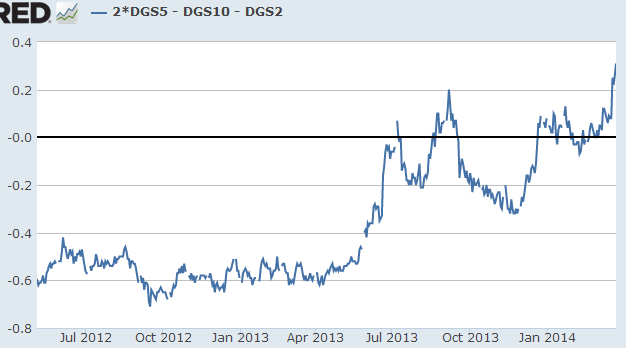
The five-year treasury yield hit a multi-year high relative to the average of the two- and the ten-year rates (the 5-year treasury is cheap on a relative basis). The chart below shows a measure of how “concave” the treasury curve has been over time (negative indicates the curve is convex).
Â
 |
| 2 x (5yr yield) – (10yr yield) – (2yr yield)Â |
Given that the five-year tenor is sensitive to the trajectory of the Fed’s rate policy in the intermediate term, this is where we should see quite a bit of volatility (see post). Â We’ve come a long way from the days when the 5-year treasury was highly overpriced relative to the rest of the curve (see story from 2012) and the market was pricing in “perpetual” QE.
Â

